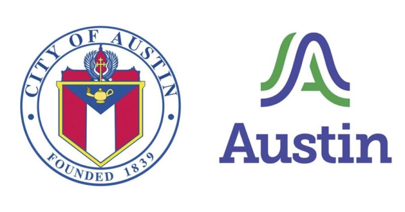
Austin officials unveiled the city’s first-ever unified logo on Sept. 4, but the $1.1 million design immediately drew criticism from residents and lawmakers.
The new mark — a wavy blue and green “A” — will replace more than 300 different city logos starting October 1. Officials said the logo represents Austin’s hills, rivers, and bridges, with colors inspired by the city’s skies and parks.
Designer DJ Stout of Pentagram described the process as “the ultimate design by committee,” adding that “Austin is a little liberal island, politically.”
Cost and Rollout
Budget records show $200,000 went to design work, $640,000 to vendors, and $115,000 to public awareness campaigns.
Digital platforms will be updated first, with vehicles, uniforms, and signage phased in over time.
City Manager T.C. Broadnax defended the project: “For the first time in Austin’s history, we will have a logo to represent the city services and unify us as one organization, one Austin.”
Political Pushback
Rep. Chip Roy (R-TX) blasted the rebrand as wasteful and “woke.”
Speaking on The Will Cain Show, Roy said city leaders “want to go spend a million dollars on a rebrand, get rid of a cross and make it some sort of, you know, a woke-looking band emblem.”
He argued that officials should focus on public safety instead of logos: “We have people in Austin who don’t get their 911 calls answered… crime has gone up because they gutted the police force.”
Resident Reaction
Residents mocked the logo online, calling it a “homeless tent,” a “bad biotech rebrand,” and “Bruhhhh.”